
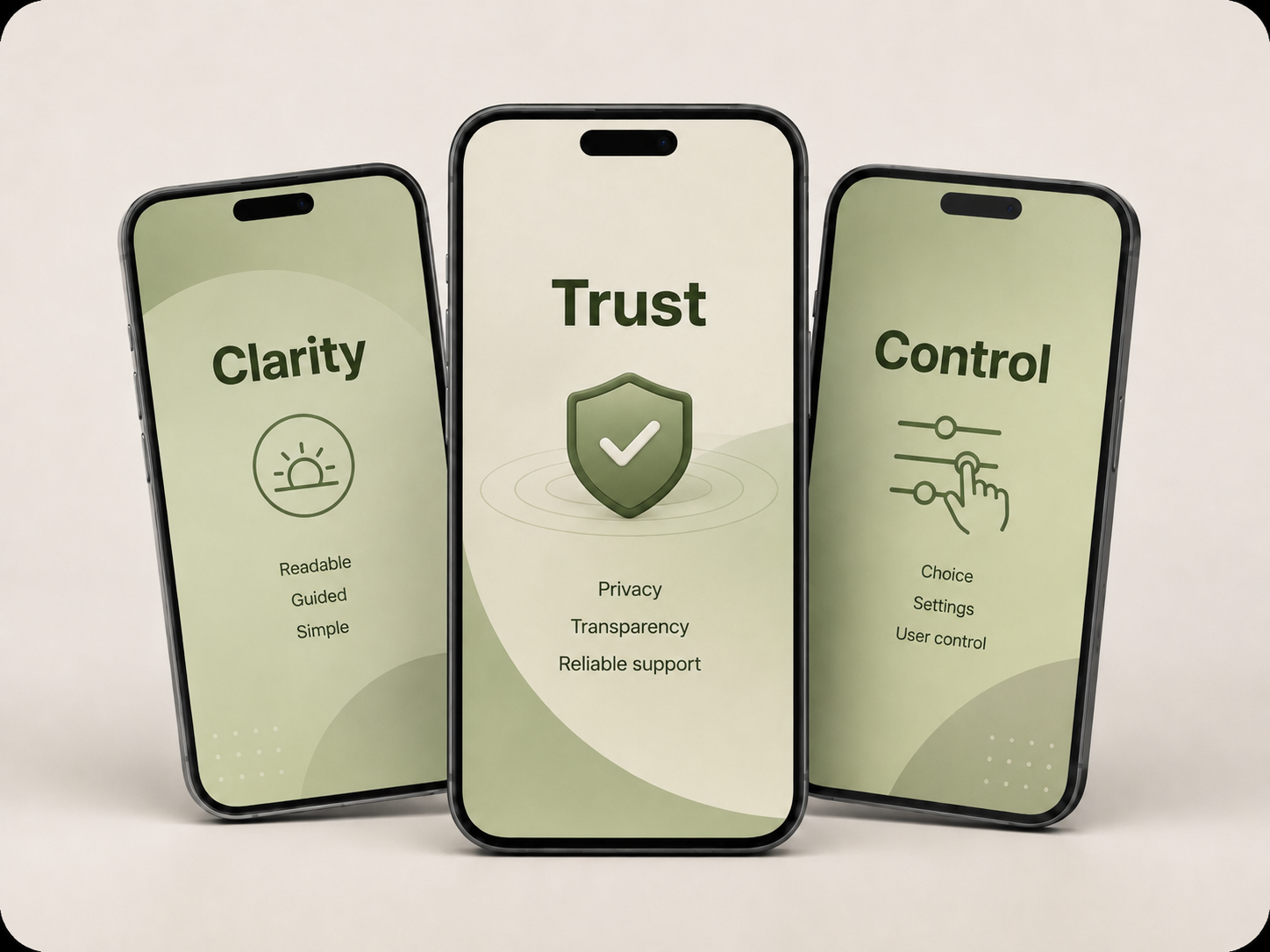
Sheltr: Designing Trust, Clarity, and Control in a Safety App
Sheltr is a safety-focused mobile app concept designed to help users access critical information, emergency tools, and support resources with confidence. My work focused on shaping the product’s UX foundation through research synthesis, feature strategy, information architecture, trust and safety considerations, accessibility planning, and high-fidelity prototype support.
Overview
Sheltr began as a safety-focused mobile app project centered on helping users find critical information, understand their rights, and access support in stressful situations. My UX work extended across the foundation of the product: research synthesis, user needs, personas, journey mapping, competitor analysis, feature planning, information architecture, trust signals, edge cases, and accessibility considerations. The goal was to create a product experience that felt clear, calm, trustworthy, and actionable — not overwhelming. While the project later required additional UI and prototype support, the core value of my work was shaping the user experience behind the product and translating research into decisions the app could actually be built around.
Project Type
Safety-focused mobile app UX case study with high-fidelity prototype support.
Audience
Users in stressful or high-risk situations who need clear guidance, trusted resources, and simple next steps.
Focus Area
UX research, product strategy, information architecture, trust and safety, accessibility, and feature planning.
Scope
Research synthesis, personas, journey mapping, competitor analysis, feature prioritization, user flows, edge cases, and prototype support.
Problem Statement
Safety apps must earn trust before users ever need them
For users navigating stressful, uncertain, or high-risk situations, confusion can make a digital product feel unusable. A safety-focused app cannot rely on dense information, unclear navigation, or vague promises about privacy and support. Users need to understand what the app does, what it does not do, where to find support, and how to take action without second-guessing the experience. The challenge was to shape Sheltr into a product experience that felt calm, credible, and easy to use — while still supporting sensitive user needs, layered information, accessibility considerations, and safety-focused decision-making.
Goals & Success Criteria
Defining what success meant for a safety-focused experience
Success was not defined by adding more features or making the app feel more complex. It was defined by making the experience easier to understand, easier to trust, and easier to act on. The goal was to shape a product foundation that reduced confusion, supported sensitive user needs, and made key information feel clear, calm, and accessible.
Evaluation criteria Mobile Experience | Trust & Safety | Usability | Clarity
Success meant users could understand the experience quickly, trust what they were seeing, and move forward without confusion.
I evaluated decisions through clarity, trust, cognitive load, and actionability. Every part of the experience needed to support user confidence, reduce unnecessary friction, and avoid creating uncertainty in moments where users may already feel stressed or overwhelmed.
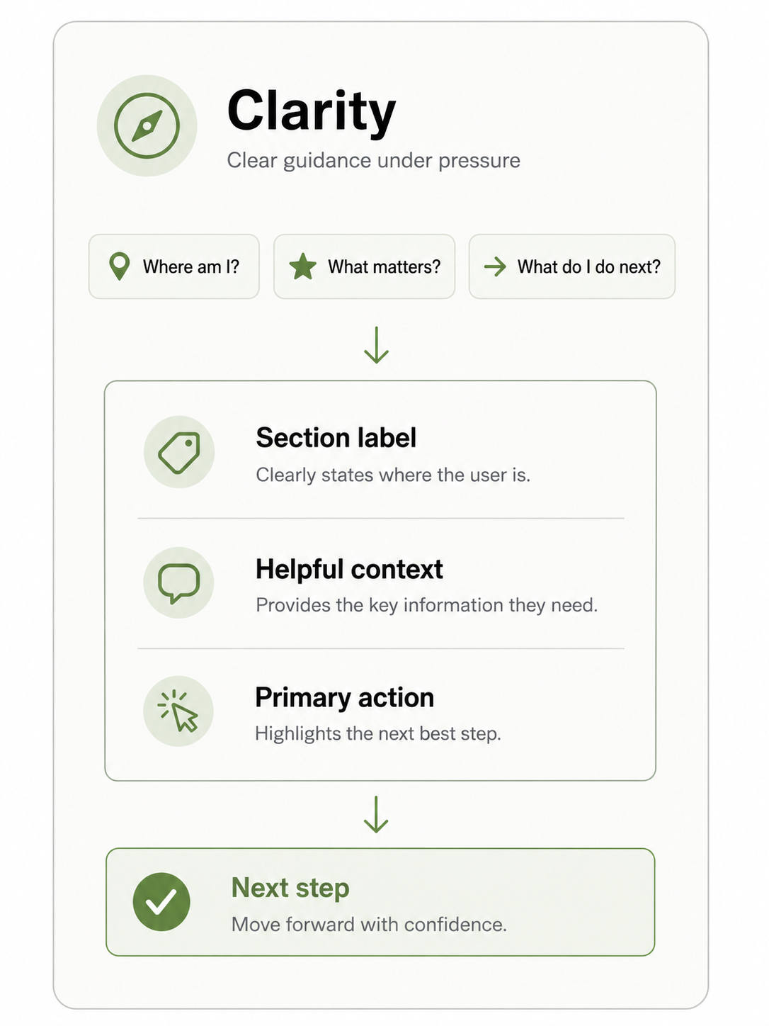
Clarity
Users needed to understand where they were, what each section meant, and what action they could take next. Labels, hierarchy, and screen structure needed to feel direct instead of vague or overly technical.
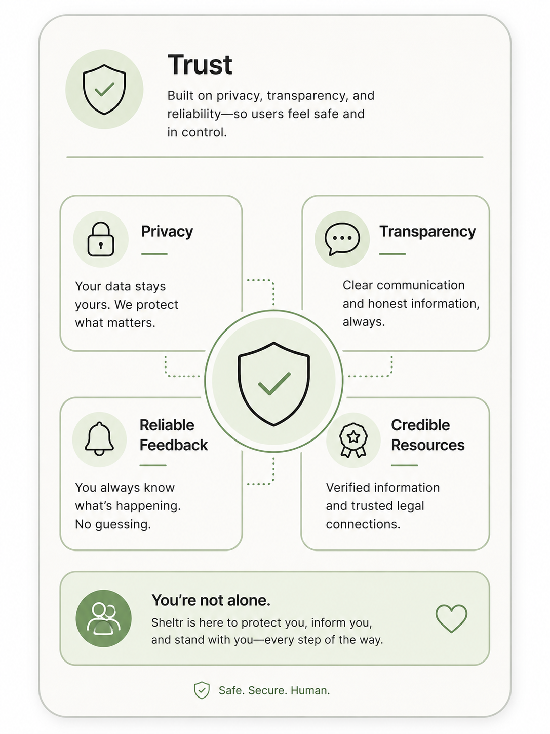
Trust
The experience needed to communicate credibility without overexplaining or making unsupported promises. Users should feel that the product is calm, transparent, and careful with sensitive information.
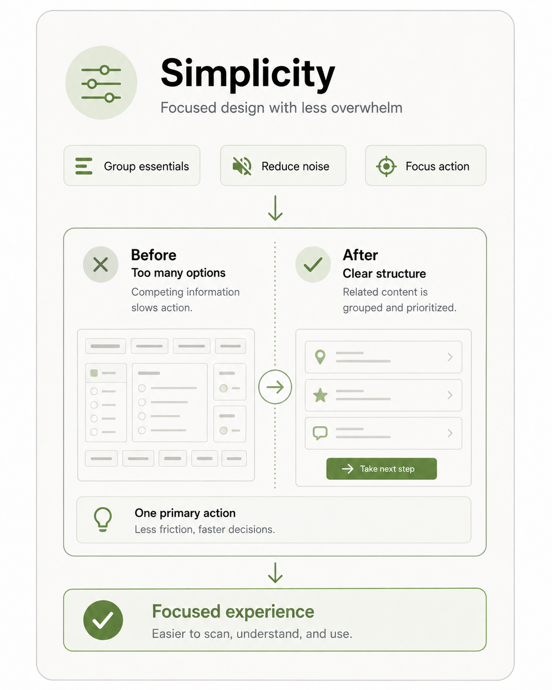
Simplicity
The structure needed to stay organized, scannable, and easy to navigate. Grouping related information and reducing unnecessary complexity helped make the experience feel more manageable under stress.
Research & Discovery
Turning research into a clearer product direction
Research helped uncover where users may need clarity, reassurance, and simple guidance most. Those findings shaped the product strategy, information architecture, and design decisions before high-fidelity prototyping began.
Key Insights
What shaped the product direction
- Users need clear guidance when situations feel stressful or uncertain
- Trust depends on transparent language, predictable structure, and careful handling of sensitive information
- Too much information at once can increase hesitation and cognitive load
- Simple, organized flows help users understand what to do next
Methods
How the direction was informed
- Synthesized user research into core needs, pain points, and opportunity areas
- Created personas, empathy maps, and journey maps to clarify user context
- Reviewed competitor patterns to identify trust, safety, and usability gaps
- Mapped edge cases and accessibility considerations to support safer product decisions
Key Decisions
Key decisions that shaped the product experience
The design direction was shaped by more than visual polish. Each decision focused on making the experience easier to understand, easier to trust, and easier to navigate under pressure. The goal was to reduce uncertainty while creating a product structure that could support sensitive user needs without feeling overwhelming.
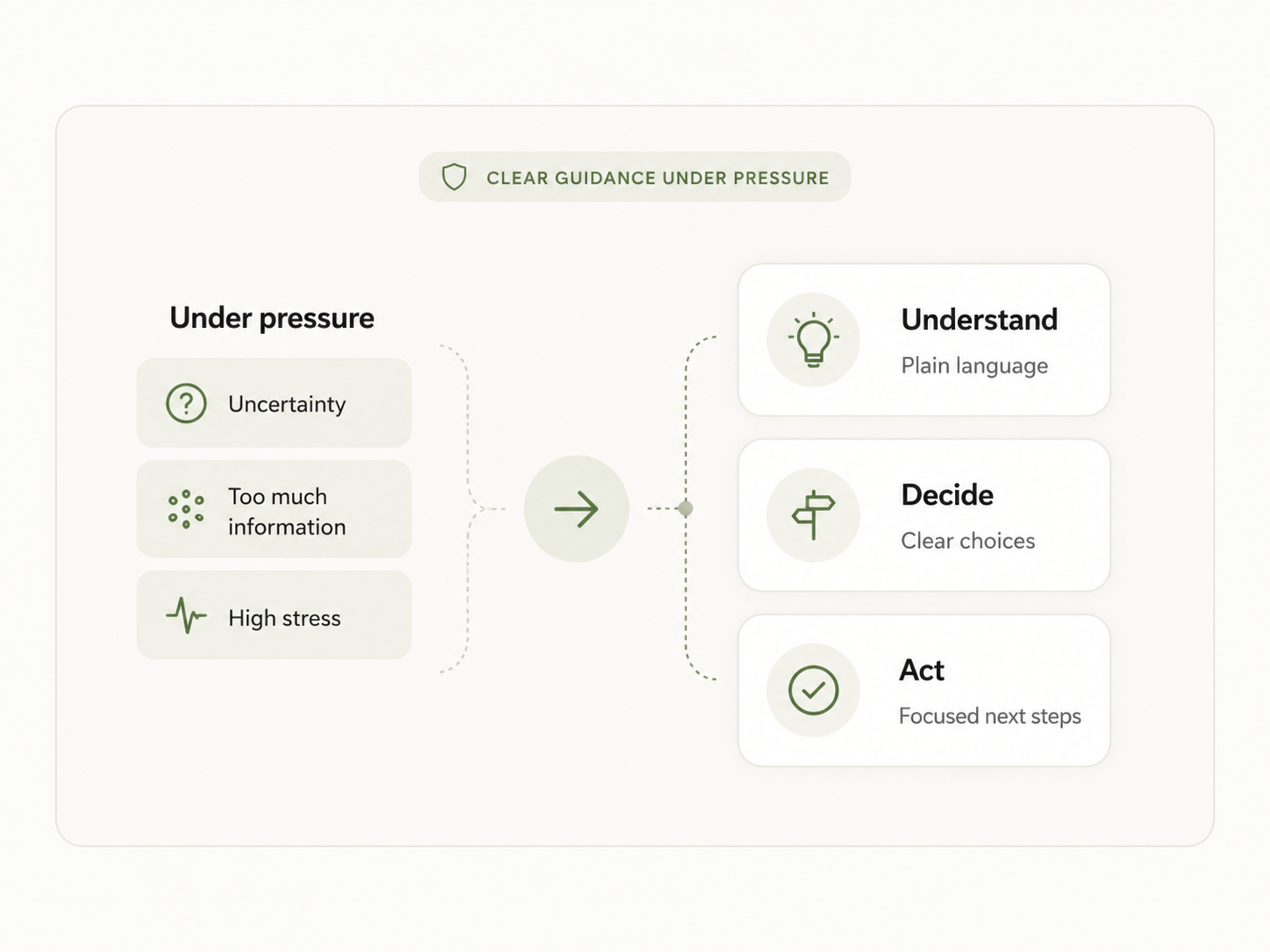
Clarity before complexity
The experience needed to feel understandable before it felt feature-rich. I prioritized clear labels, direct language, and organized content structures so users could quickly understand where they were and what each section was meant to help them do.
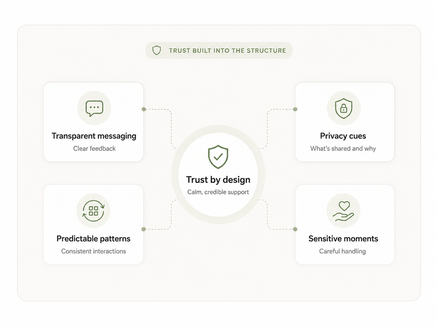
Trust built into the structure
Trust could not rely on tone alone. The product needed transparent messaging, predictable patterns, and careful handling of sensitive moments. I focused on making the experience feel calm and credible without overpromising or overwhelming users with unnecessary detail.
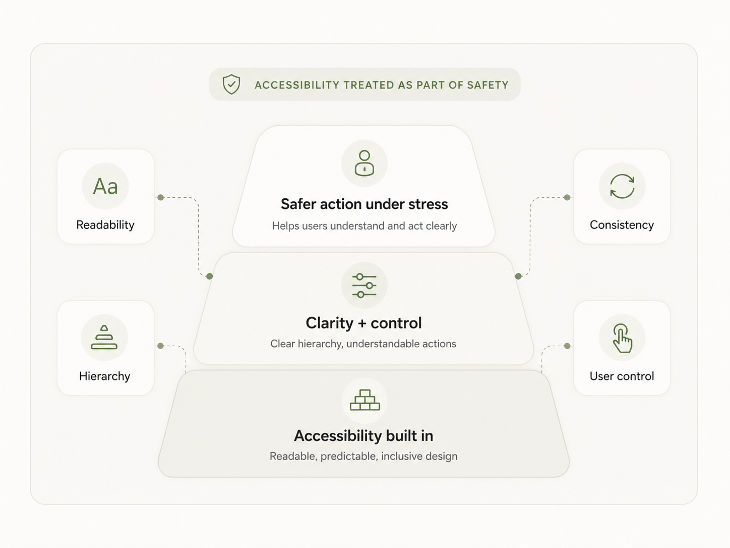
Accessibility treated as part of safety
Accessibility was not treated as a separate layer added at the end. Readability, hierarchy, interaction consistency, and user control were considered part of the safety experience because users need to understand and act on information clearly, especially under stress.
Focused research
This project reinforced that research is only valuable when it turns into clear product decisions. The strongest UX work came from translating user needs, pain points, and opportunity areas into a product structure the team could actually build around.
Trust shapes usability
For a safety-focused product, trust is part of the user experience. Clear language, predictable patterns, thoughtful hierarchy, and careful handling of sensitive information all helped the experience feel calmer and more credible.
Clarity beats complexity
The goal was not to make the app feel bigger or more impressive. It was to make the experience easier to understand. Simple flows, organized content, and direct interaction patterns created more value than unnecessary complexity.