
Bianco Brothers Manufacturing Website Redesign
Bianco Brothers Manufacturing had a long-standing reputation in the commercial seating industry, but their website no longer reflected the quality, credibility, or scale of the business. The site felt visually outdated, was difficult to navigate, and did not clearly communicate what the company does or who it serves—creating friction for architects, designers, and other commercial buyers evaluating the company online.
Overview
This project focused on redesigning the Bianco Brothers Manufacturing website to better reflect the company’s legacy, craftsmanship, and modern capabilities. The goal was to create a clearer, more credible digital presence that simplified navigation, clarified service offerings, and helped commercial buyers better understand the company’s value — while still respecting the realities of an established manufacturing business.
Project Type
B2B Manufacturing
Audience
Commercial Clients, Architects & Designers
Focus Area
Information Architecture, UX Clarity, Visual Refresh
Scope
Website Structure, UI Design & UX Improvements
Problem Statement
When a trusted manufacturing brand feels outdated online
Bianco Brothers Manufacturing had built decades of trust through craftsmanship and long-term client relationships, but their website no longer reflected the quality, scale, or professionalism of the business. The experience felt dated, difficult to navigate, and unclear about the company’s offerings. For new visitors — especially architects, designers, and commercial buyers — the site did not establish credibility quickly or make it easy to understand the brand, evaluate its capabilities, view relevant work, or move toward a quote or contact inquiry.
Goals & Success Criteria
Defining what success meant for this project
These goals guided design decisions throughout the project and kept the focus on real user and business needs. Success meant creating an experience that clearly communicated Bianco Brothers’ offerings, made key information easier to find, and helped potential clients evaluate the company with greater trust and confidence.
Evaluation criteria Web Experience | Clarity | Usability | Business Credibility
Create a clear, trustworthy experience that reflects the quality of the business
Success meant creating a simpler, more trustworthy experience that clearly communicated what Bianco Brothers offers and positioned the company as a credible, capable manufacturing partner. The redesign focused on helping new visitors — especially architects, designers, and commercial buyers — understand the business quickly, navigate with less friction, and move forward with greater confidence.

Usability
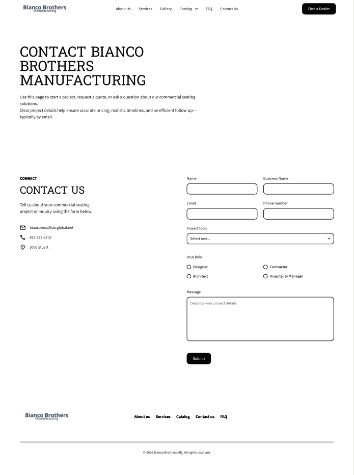
Simplify navigation and page structure so users can quickly find services, capabilities, and contact pathways without unnecessary friction.
Clarity
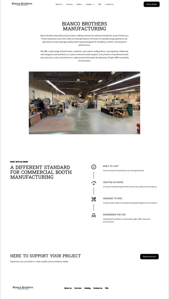
Clearly communicate what Bianco Brothers does, who they serve, and what sets them apart for first-time visitors evaluating the business.
User Confidence
Create a modern, professional visual system that reflects the company’s craftsmanship, credibility, and long-standing reputation.
Research & Discovery
Understanding where clarity and trust were breaking down
A focused audit of the existing site, content structure, and competitive landscape revealed friction in navigation, gaps in service clarity, and missed opportunities to better communicate credibility, specialization, and modern capability. Competitive research included 20 businesses across direct, indirect, and national competitor categories to better understand market positioning, service overlap, and opportunities for differentiation.
Key Insights
What surfaced during the audit
- It was not immediately clear what the company specialized in
- Services and capabilities were not organized clearly
- Legacy-focused messaging downplayed modern strengths
- The visual presentation did not reflect the company’s craftsmanship or credibility
Methods
How the evaluation was conducted
- Heuristic evaluation of the existing website
- Content and information architecture audit
- Competitive analysis of 20 direct, indirect, and online/national competitors
- Stakeholder conversations to clarify business priorities and goals
Key Decisions
What this project strengthened in my process
This redesign reinforced that clarity often creates more value than complexity. Simplifying structure, tightening messaging, and aligning the visual system with the company’s craftsmanship had a greater impact than adding unnecessary features or over-designing the experience.
Clarity over decoration
Improving structure and messaging created more value than visual polish alone.
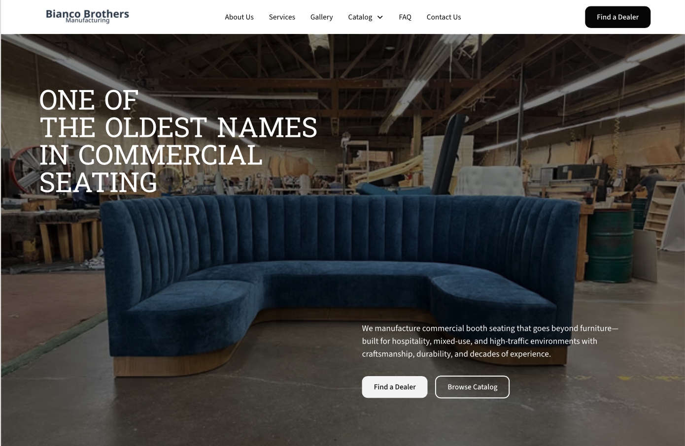
Trust is built in seconds
Clear positioning and a modern presentation helped establish credibility faster with new visitors.
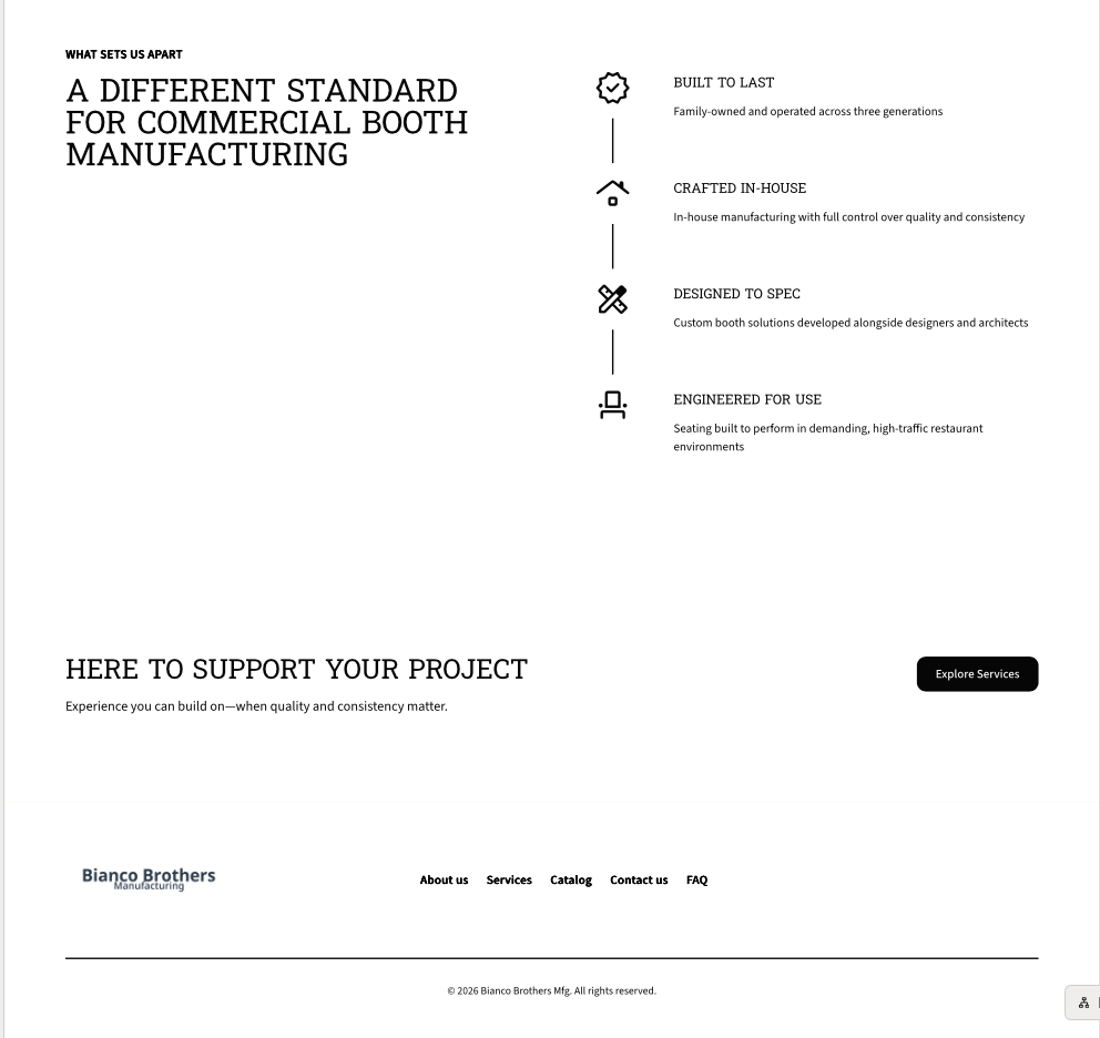
Restraint is a strength
Removing friction and simplifying navigation made the experience feel more focused, usable, and confident.
From structure to refinement
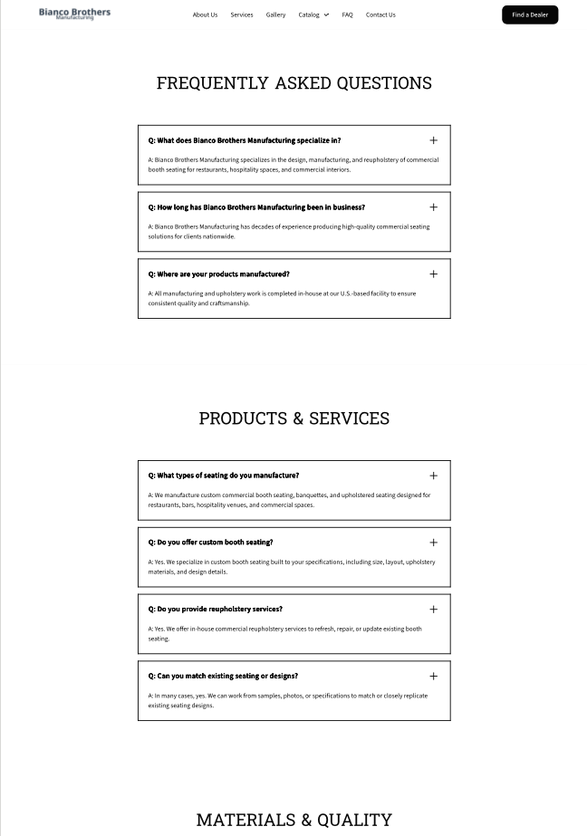
Early wireframes focused on simplifying navigation, reorganizing services, and clarifying content hierarchy before moving into visual direction. This helped prioritize structure, usability, and service clarity before adding higher-fidelity design details.
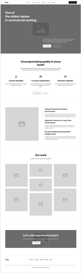
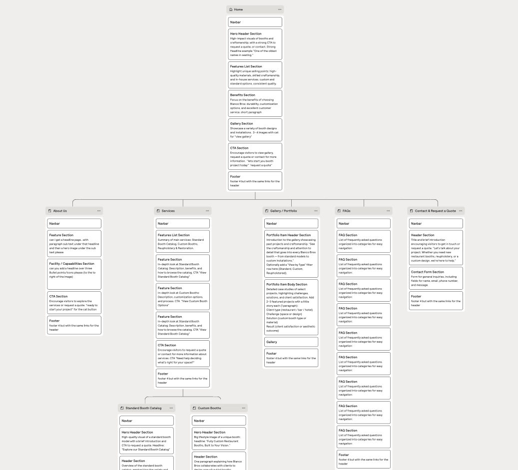
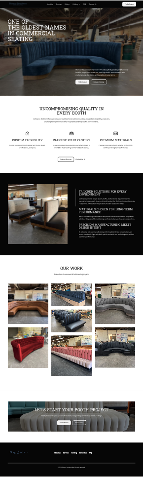
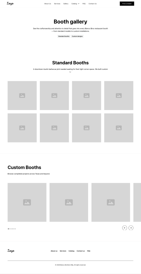
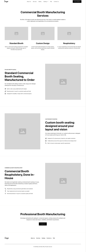
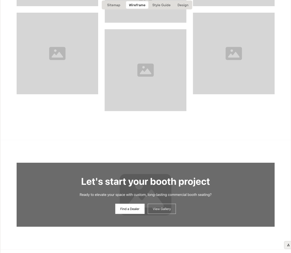
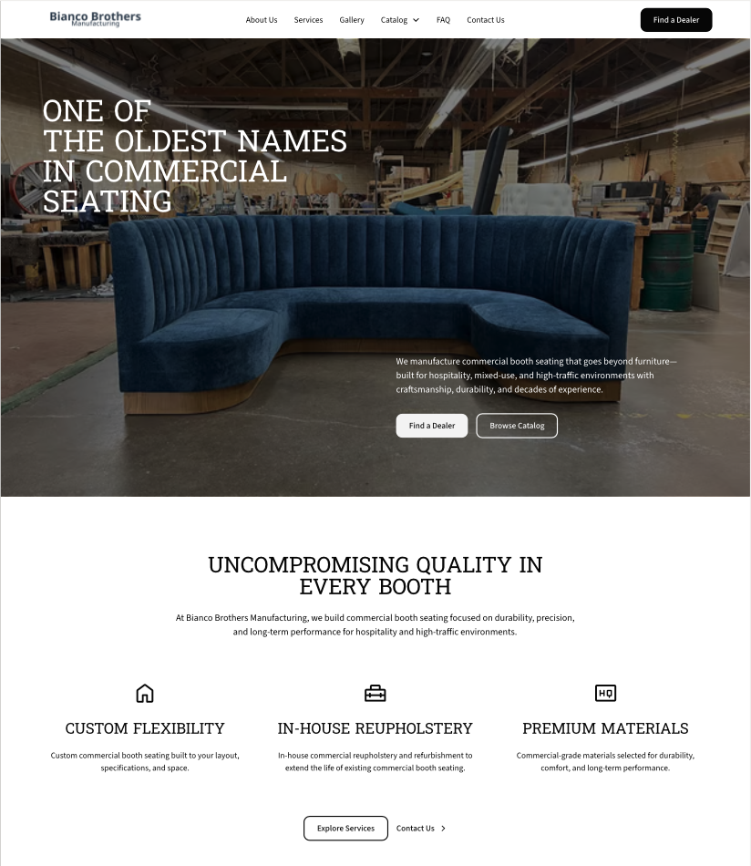
A clearer, more credible digital presence
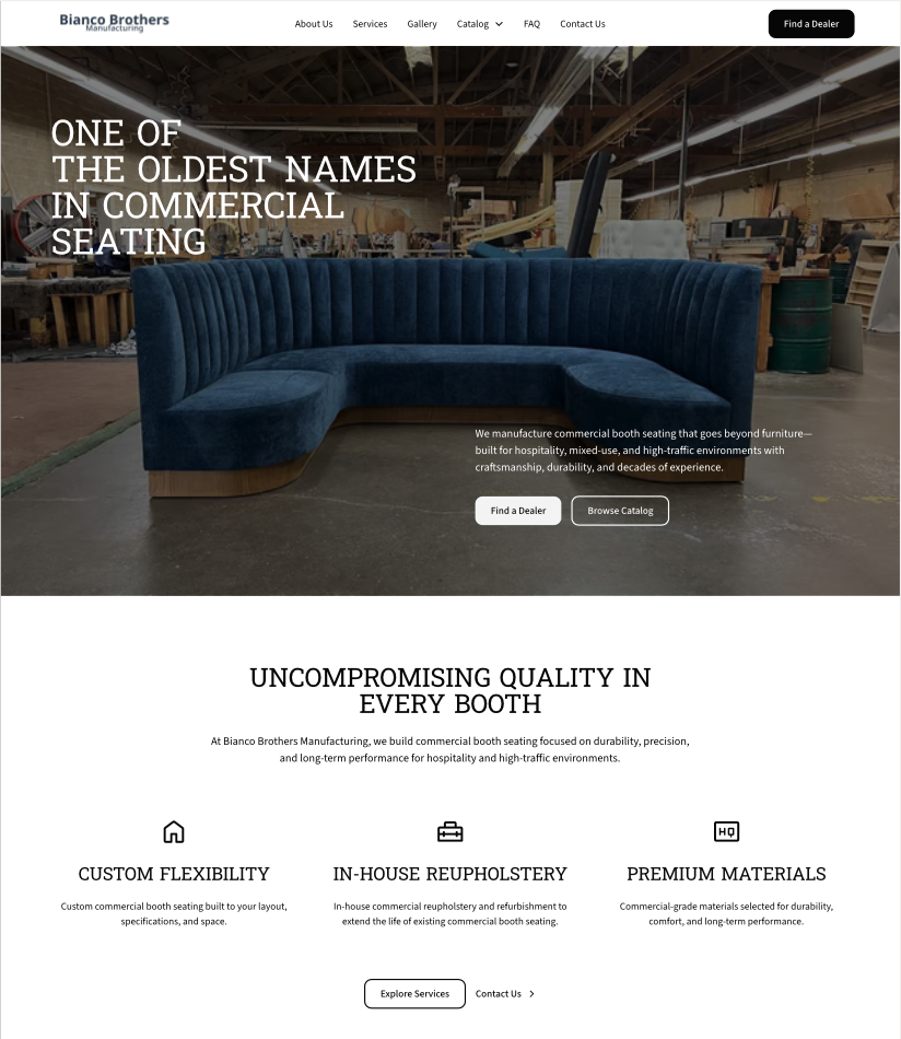
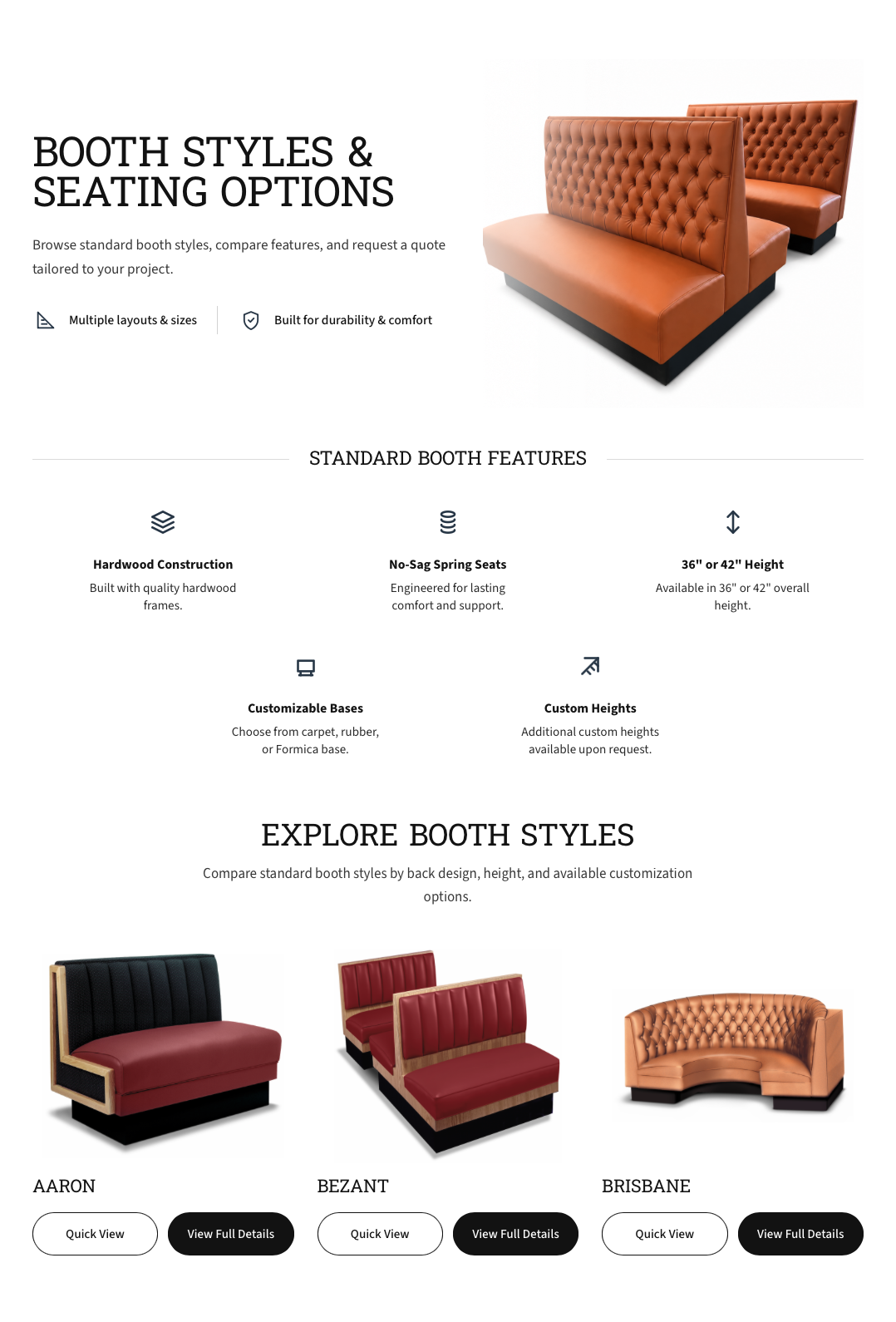
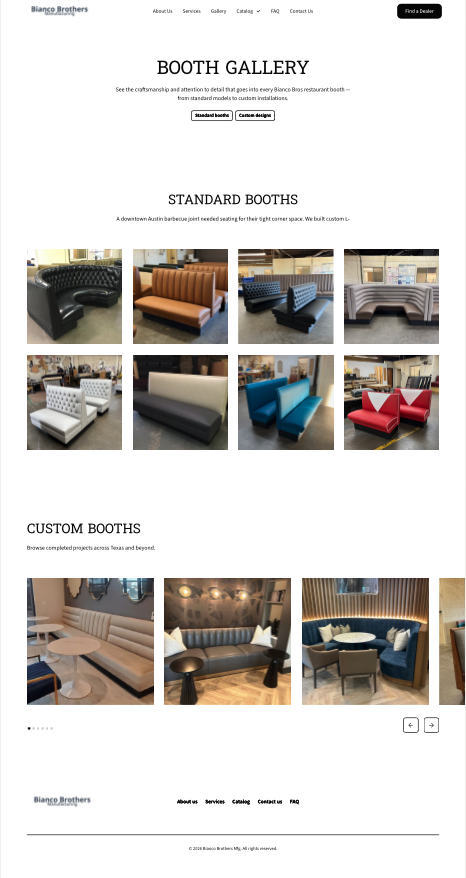
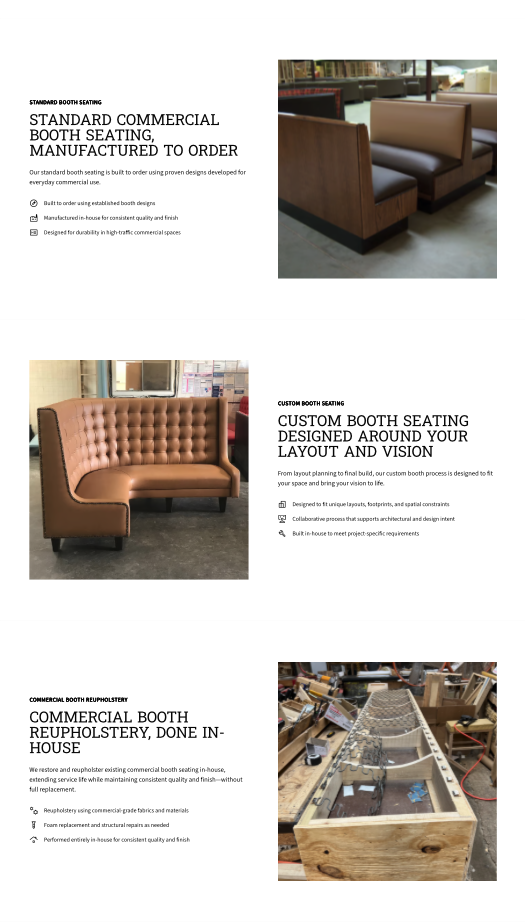
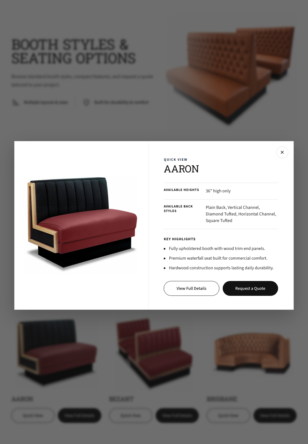
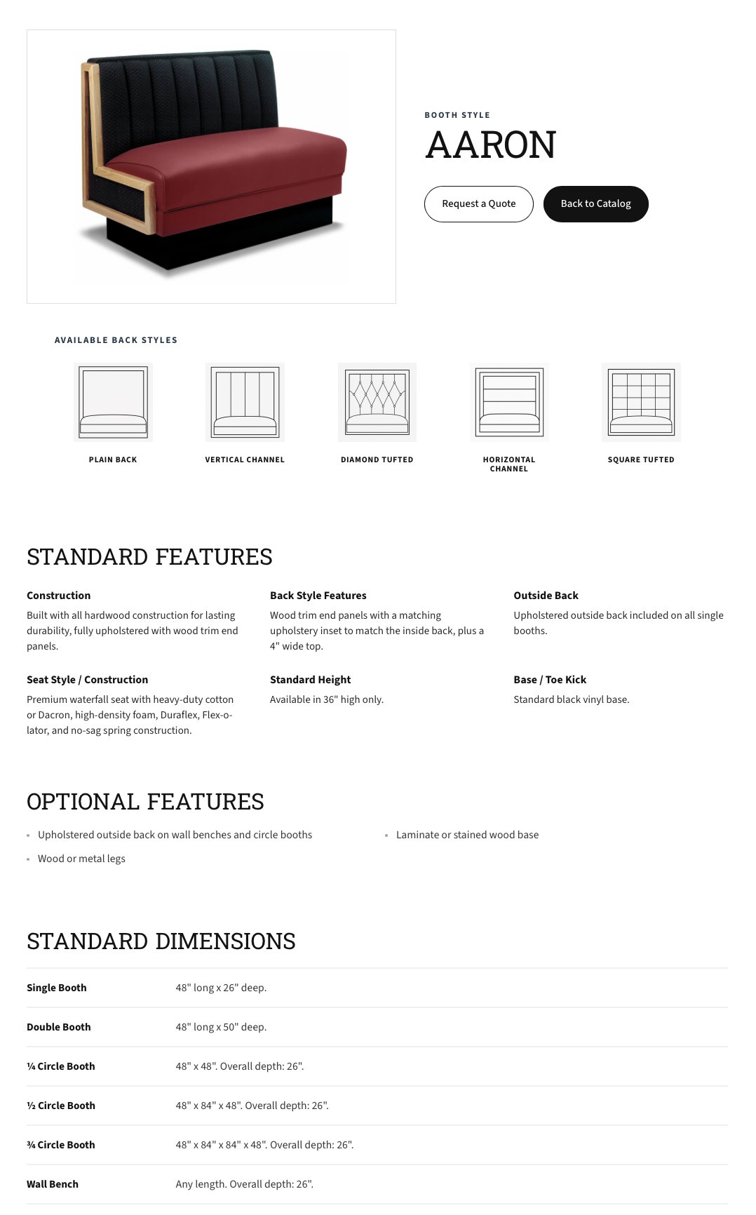
The final design strengthens credibility, clarifies core services, and makes key actions easier for commercial buyers to understand and complete. The experience was designed to help first-time visitors quickly understand the company’s capabilities, view relevant work, explore booth styles, and move toward contact with more confidence.
What worked
Simplifying structure, clarifying messaging, and improving visual credibility made the experience easier to understand and more aligned with what commercial buyers expect from an established manufacturing partner.
What I would refine
With more time after launch, I would validate the updated structure through usability testing, review how quickly users understand the company’s services, and explore deeper content strategy around project examples, service details, catalog behavior, and conversion pathways.
What I learned
This project reinforced that strong UX is not always about adding more. Clear structure, focused positioning, and credible presentation can create meaningful business value by helping users understand, trust, and act with more confidence.